Before and After: Joan Friedlander’s New Site
By Jessica Albon
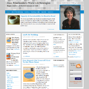
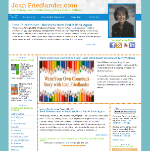
When client Joan Friedlander came to us, she knew she wanted a site that was playful, energetic, and welcoming. She wanted something with polish and presence. And because she was launching a brand new business, she wasn’t comfortable making a big, one-time investment in the design. So, what we did instead was we created a professional website design that met all of her criteria and then, little by little, we rolled out the changes each month. The final site was just made live last week and I’m delighted to share the before and after with you. (Note: both images link to full size versions, so be sure to click on one or both to see them larger.)
Before: |
After: |
And here’s what Joan had to say about the new site:
“I really love it. It’s unique and it’s reflective of me. Jessica is fun to work with, is patient with changes, yet also on task. She is not only artistically creative, she is also technically skilled. The site looks good *and* it has technical integrity.”
Blog


