Website Color Scheme & Your Client Attraction Style
By Jessica Albon
 Your Brand Siren gives you a complete roadmap on everything from your website design to how to write your newsletter. What you might not have realized was that it can also point you in the right direction of the details, too. For instance, your Client Attraction Style is the perfect place to look for the right color scheme for your marketing materials! Find your type below to see what it means to the colors you use.
Katharine Hepburn
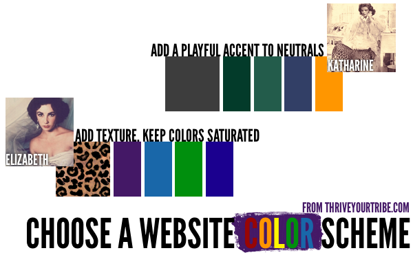
Kats are funnier than the rest of us–they’re the ones who can get away with long rants in their blogs and newsletters and people shower them with love and adoration. The ones who need to bring plenty of “tough love” to their work with clients, and balance it with a soft touch. They’re straight shooters with a playful side and require a color scheme to back that up.
The best mix is usually mostly neutral with a playful color or two thrown in for spark. A bit of orange, pink, or bright green gives the site a personality that lets visitors know right from the start that the Kat-style site won’t be like anything else they’ve visited that day.

A couple of schemes to try: sepia tones plus teal, grays and a bright orange, corporate blue plus pink.
Liz Taylor
Lush and seductive, the Liz Taylor style requires texture. In your business cards, that can mean letterpress printing, great cardstock, and a touch of high-gloss ink. On the web, that means wood grain textures, layered professional website design, and lots of carefully selected details. Since true sheen isn’t achievable on the web, look for other ways to add depth and texture, like etching effects, embossing (carefully and subtly used) and colors that are saturated and dynamic.
A common mistake with the Liz style is to go overboard with the colors in an attempt to make things interesting–instead, rely on a handful of carefully chosen colors because for your materials, less is definitely more. Liz’s colors are often similar to Audrey’s but need to be a touch more sophisticated.
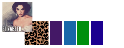
A couple of schemes to try: A dark, deep texture (like wood grain or wallpaper) plus neutrals, muted purples and greens plus dark gray to ground it, dark oranges with gray for a sophisticated yet friendly site.
Are you starting to see the ripples of your Brand Siren? It’s even easier if you take the quiz and then take me up on your complimentary consultation! From the way you write the text on your home page to the color you choose for your brochures, your Brand Siren will make everything you do to market your business, better. (Plus, having a role model makes everything a heck of a lot easier!)
So, start with the quiz, then let’s talk one-on-one so that you can explore what this means to you, and to your business.
(If you missed part one, it’s here.)
Blog


